


After a decade of swing-from-minimal-to-maximal, most of us want the sweet spot: layered, personal rooms that look current without feeling crowded. Below are seven research-informed, designer-approved rules to help you shape a living room that’s functional, airy, and warm. I’ll share clear measurements, small upgrades with big impact, and yes—some contrarian takes. Use this as a blueprint, then bend the rules to your life (definately do).

1) Hang Curtains Higher and Longer (It’s Not Just a Look—It’s Perception + Daylight)
Visually taller windows make rooms feel larger and more refined. Instead of mounting the rod just above the window, go high and wide. Two reliable approaches:
- Height: place the rod 4 to 6 inches above the top casing—or roughly two‑thirds of the way to the ceiling for rooms with generous height. This elongates the wall and better frames the opening.
- Width: extend rods 6 to 12 inches past each side, so drapery clears the glass when open and you keep more natural light.
- Length: aim for curtains to “kiss” the floor or form a light 0.5–1 inch break. Puddling can be pretty but tougher to clean.
More daylight isn’t just aesthetic. Daytime light exposure is associated with better sleep and well‑being in multiple studies. Office workers with more daylight reported better sleep quality and more physical activity—effects that translate to home when you preserve and bounce daylight deeper into the room. See research from the Journal of Clinical Sleep Medicine and the APA on nature/light and mood below.
- Energy bonus: lined drapery and cellular shades can cut heat loss/heat gain at windows and improve comfort. See the U.S. Department of Energy’s guidance on window attachments.

Useful links: U.S. DOE: Energy‑Efficient Window Attachments • Daylight & Sleep Quality (J Clin Sleep Med) • APA: Nurtured by Nature • Architectural Digest: How to Hang Curtains
2) Leave Negative Space on Purpose (Think 80/20 and Stress‑Proof Your Floor Plan)
Cluttered rooms aren’t just visually noisy—they correlate with higher stress. The UCLA Center on Everyday Lives of Families documented how accumulated household stuff raises tension, especially for parents juggling busy schedules. Build in emptiness on purpose.
- 80/20 rule: let furnishings, art, books, and textiles occupy about 80% of the visual field; hold back 20% for breathable negative space. You’ll notice both your favorite pieces and the architecture more.
- Movement: preserve 30–36 inches for main walkways; 16–18 inches between coffee table and sofa for easy reach.
- Wall relief: not every wall needs something. One quiet wall makes the feature wall sing.
Empty space isn’t wasted space—it’s what allows everything else to read as intentional.

Useful links: UCLA: Life at Home in the 21st Century • ADA: Accessible Route Clear Width (36 in.) • Human Dimension & Interior Space (Panero & Zelnik)
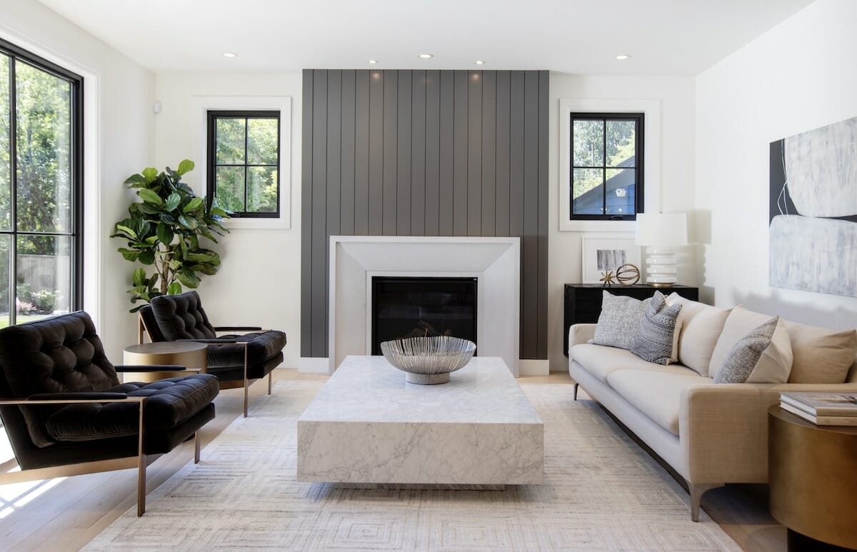
3) Size Your Rug to the Room (and How to Layer If It’s “Too Small”)
Right-sized rugs anchor seating areas and prevent a “floating furniture” look. A dependable rule: front legs of sofas and chairs sit on the rug, with 18–24 inches between rug edge and walls. If your dream rug is smaller:
- Layer it on a larger, neutral base (jute/sisal/wool flatweave). The base rug frames the focal rug like a mat around art.
- Let the furniture do the framing. For a sectional with chaise, run a smaller rug vertically along the chaise to visually split the sectional into two zones.
- Aim for at least 6–8 inches of rug under the front legs to stabilize chairs and prevent splaying.
Health note: rugs and carpets trap dust and allergens (good!) but must be vacuumed regularly with a HEPA filter and maintained to avoid re‑emission. Sensitive households can prefer low‑pile wool and routine cleaning.

Useful links: Architectural Digest: Rug Size Guide • EPA: Carpet & Indoor Air Quality • EPA: Guide to Air Cleaners in the Home
4) Bring the Outdoors In (Oversized Branches, Real Texture, Biophilia)
Biophilic design—incorporating nature’s forms and materials—has measurable benefits: reduced stress, improved attention, and higher perceived well‑being. You don’t need to be a plant whisperer to get the effect.
- Oversized, sculptural branches in a simple vase deliver scale and movement with minimal maintenance. Swap seasonally (olive, magnolia, quince, maple).
- Mix in tactile, natural materials: linen, wool, clay, stone, oiled wood. Even a single raw clay vessel against books adds a grounded note.
- Pet safety: double‑check plant toxicity with the ASPCA database before you clip or buy.

Useful links: Terrapin Bright Green: 14 Patterns of Biophilic Design • Ulrich (1984): View Through a Window & Recovery • ASPCA: Toxic & Non‑Toxic Plants
5) Retire the Literal Farmhouse, Keep the Warmth (How to Update Without Starting Over)
Unless you live on a working farm, overt “farmhouse” motifs (script signs, heavy shiplap everywhere, wagon wheels) can date a space. The 2024–2025 consumer surveys show homeowners leaning toward “transitional,” “contemporary,” and “warm minimal” rather than rustic‑literal themes.
- Swap fixtures: replace lantern‑style chandeliers with simple linen drums or slim metal forms; update barn‑door hardware to quieter profile tracks.
- Edit surfaces: keep shiplap to functional spaces (mudroom) or paint it a deeper, matte tone to read as subtle texture, not theme.
- Balance with refined pieces: tailored upholstery, fewer distressed finishes, and one or two heritage items (a real antique trunk beats a faux treatment every time).

Useful links: ASID: 2024/2025 Trends Outlook • Houzz & Home Studies • Zillow Research: Home Trends & Buyer Preferences
6) Add Curves—Barrel Chairs Are the Easy Button
Living rooms are boxy by default. Rounded silhouettes—barrel chairs, drum tables, arched lamps—soften edges and create flow. There’s even psychology behind it: people tend to prefer curved over sharp objects, likely because rounded forms feel safer and more approachable.
- Conversation layout: two barrel chairs angled toward a sofa can build a natural triangle for eye contact.
- Small space move: place a single barrel chair diagonally across from a sectional chaise to define zones without crowding.
- Clearances: keep 30–36 inches behind chairs for paths; 8–10 inches between a side table and the chair’s arm so drinks land comfortably.

Useful links: Psychological Science: Preference for Curved Objects • ADA: Circulation Clearances
7) Choose “Chameleon” Neutrals and Tune Them with Light
True gray had its moment, but undertoned neutrals (with a whisper of blue, green, or peach) adapt to changing light through the day, preventing the putty look. Pair color with the right light quality and dimming to shape mood on demand.
- Try these versatile paints: Glidden Whirlwind • Benjamin Moore Manchester Tan • Farrow & Ball Ammonite • Backdrop Harajuku Morning
- Lighting basics: use warm LEDs (2700–3000K) in living rooms at night for a relaxing vibe; shoot for CRI 90+ so colors render accurately.
- Dimmers matter: they reduce energy use and let you swing from reading‑bright to movie‑soft. Layer ceiling, floor, and table lights on separate controls.
- Day vs. night: embrace bright, indirect daylight during the day; in the evening, dim and avoid glare to support natural circadian cues. I learned the hard way that a single cold 4000K bulb can make paint look flat and, honestly, a bit sad.

Useful links: U.S. DOE: LED Lighting (color temperature, CRI) • U.S. DOE: Lighting Controls & Dimmers • Sleep Foundation: How Light Affects Sleep
Bonus: Quick Planner (Tape, Test, Then Buy)
- Map circulation: blue tape 36‑inch paths from doorways to seating and to the kitchen/hall. Dont block them.
- Rug first: choose rug size and placement, then set seating to it.
- Curtain mockup: hold rods higher than you think, step back, and check sightlines from a seated position.
- Light layering: put a lamp at each “task” zone (reading chair, sofa end, media unit) before adding decorative fixtures.
- Swatch smarter: paint 2×2 ft sample boards and move them around morning/noon/night to catch undertones.
- Health check: prefer low‑VOC paints and GREENGUARD Gold–certified furnishings when possible.
References & Further Reading
- Boubekri et al. (2014). Impact of Windows and Daylight Exposure on Sleep Quality. Journal of Clinical Sleep Medicine.
- American Psychological Association: Nurtured by Nature
- UCLA: Life at Home in the 21st Century (CELF)
- U.S. DOE: Energy‑Efficient Window Attachments
- U.S. DOE: LED Lighting (Color Temperature, CRI)
- U.S. DOE: Lighting Controls and Dimmers
- Bar & Neta (2006). Humans Prefer Curved Visual Objects. Psychological Science.
- Ulrich (1984). View Through a Window May Influence Recovery. Science.
- Terrapin Bright Green: 14 Patterns of Biophilic Design
- EPA: Carpet and Indoor Air Quality
- EPA: Guide to Air Cleaners in the Home
- U.S. Access Board: ADA Accessible Routes
- ASID: Interior Design Trends Outlook
- Houzz Research: U.S. Houzz & Home Studies
- Zillow Research
- Architectural Digest: How to Hang Curtains
- Architectural Digest: Rug Size Guide
- UL GREENGUARD Certification Program
Design is a set of choices. Use the rules above as starting points, then adjust to your architecture, your light, and your life. The goal isn’t to be perfect—it’s to feel at home.


